
How to Read Liquidity in Crypto: A Guide to the Key CoinGlass Legend Indicators
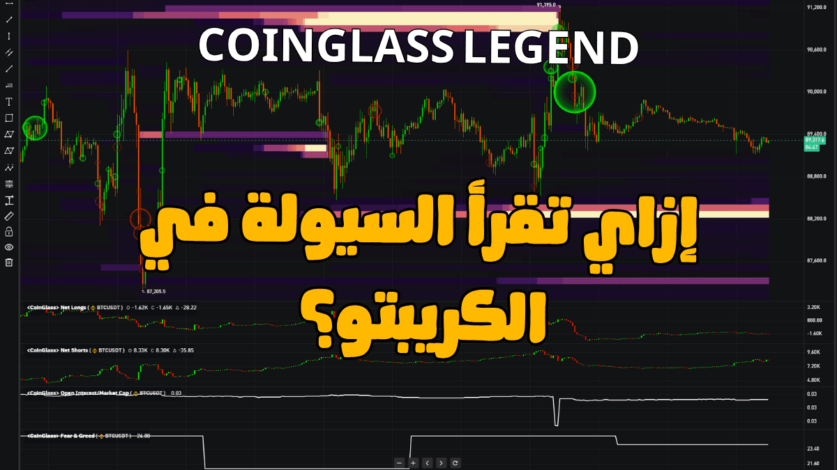
Surely, you’ve seen a chart before covered in colors, lines, circles, and liquidity everywhere… and then you find the person who posted it left it there without any explanation, as if it were classified nuclear technology 😂
But once you actually understand this data, you’ll start looking at price action in a completely different way.
Instead of just looking at the candle and saying:
“The price went up.”
You’ll start asking:
Why did it go up?
Who is buying?
Are new positions being opened?
Or are people closing shorts?
Is the move backed by real buying?
Or is the price moving toward an area filled with liquidations and liquidity?
And this is where liquidity indicators and Order Flow come in.
One of the tools that brings a large amount of this data together in one place is: coinglass legend
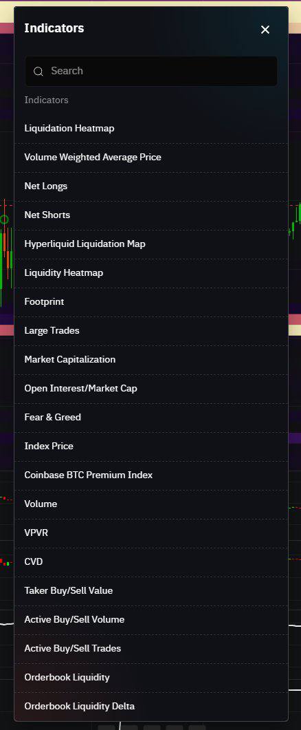
The platform combines charts with liquidity and Order Flow tools such as Liquidity Heatmap, Footprint, Large Trades, and more.
So instead of jumping between multiple websites, you can monitor different types of data alongside the price action itself.
But before I explain the indicators:
Don’t put 19 indicators on your chart and wait for divine inspiration to strike 😂
Understand what each one is telling you first, then choose the ones that actually fit your own trading style.
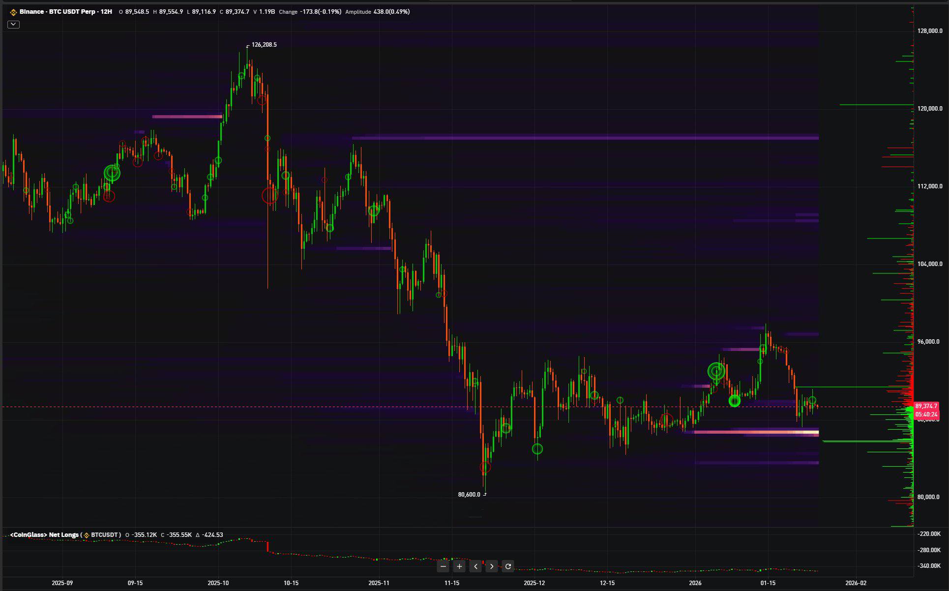
One of the most important tools you can use when trading crypto, especially if you want to understand how the futures market affects price action, is the Liquidation Heatmap.
The Liquidation Heatmap shows you areas where there is a high concentration of potential liquidations from leveraged positions.
Simply put:
If a large number of traders have Long positions with leverage, there are certain price levels where those positions could be liquidated if the price reaches them.
The same applies to Shorts.
CoinGlass calculates these areas using market data and leverage levels, then displays them as a Heatmap. So these are expected liquidation zones, not confirmed orders sitting there waiting to be executed.
And that distinction is very important.
When you find a large concentration of potential liquidations near the current price, that area deserves your attention.
The price might move toward it.
A Liquidation Cascade might occur if liquidations start triggering.
Or the price might reverse before reaching it altogether.
So don’t look at it like this:
“There’s liquidity above → the price has to go up.”
No.
Think about it like this:
“There’s a potentially important event if price reaches this area… now let me see what the rest of the data is telling me.”
VWAP is the average price, but it’s not a regular arithmetic average.
The price is weighted based on trading volume, meaning the price levels where more trading occurred have a greater weight in the calculation.
This gives you a useful Benchmark for understanding where the current price is trading relative to its volume-weighted average price.
If the price stays above VWAP for a period, the market is trading above its volume-weighted average. If it stays below, it’s trading below the average.
But keep in mind:
Price being above VWAP doesn’t automatically mean buyers are going to win. And the opposite is true as well.
What matters more to me is:
How is price reacting to it?
Does the price keep returning to VWAP and then getting accepted and bouncing?
Or did a clear Break occur, causing the market to start treating VWAP as resistance?
So use it as a price reference, not as a Buy and Sell button.
These help you track changes in Long and Short positions.
The idea here isn’t simply:
“Does the market have more Longs or Shorts?”
What matters more is:
How are those positions changing as price moves?
For example, if price is rising while Long positions are increasing, that’s a different scenario from price rising while a large number of Short positions are being closed.
Both can produce a green candle, but what happened beneath that candle is completely different.
And that’s exactly what this type of indicator is designed to show you:
Instead of looking at price alone, you can also see what traders are doing while price is moving.
It’s the same basic idea as tracking liquidation zones, but here the focus is on Hyperliquid data.
And this has become increasingly relevant as activity on the platform has grown and larger positions are being held there.
CoinGlass provides data that tracks Hyperliquid, including large traders’ positions and data related to liquidations and open positions.
But again:
Don’t forget that you’re looking at one part of the market, not the entire crypto market.
Be careful here, because a lot of people confuse this with the Liquidation Heatmap.
Liquidation Heatmap
Focuses on potential liquidations of leveraged positions.
While:
Liquidity Heatmap
Focuses more on the liquidity available in the Order Book at different price levels.
In other words, it highlights areas with larger concentrations of pending orders. This can help you identify where the market has greater Depth, as well as areas that may act as support, resistance, or zones attracting market attention.
But there’s an important warning:
A pending order isn’t a marriage contract 😂
The trader can cancel it. They can modify it.
And there are practices where traders place large orders simply to create a misleading impression of supply and demand.
So don’t automatically assume that every large order you see is genuine liquidity waiting to be executed.
That’s why the liquidity you see right now doesn’t necessarily mean it will still be there when price reaches that level.
CoinGlass itself warns that Order Book orders can be modified or canceled, so the Heatmap should always be analyzed alongside the other available data.
Here, you start seeing the large trades that were actually executed.
And that’s different from the Order Book.
Order Book:
Intent to execute
Large Trades:
A trade that actually happened
So if you start seeing very large Market Orders appearing around an important area on the chart, it’s definitely worth watching.
Especially around:
* A key high
* A key low
* A Breakout
* A Liquidity zone
* Strong Support or Resistance
But don’t think:
“A large buy order = the whales know price is going up.”
It could be:
* An entry
* A Short being closed
* A Hedge
* Part of a larger strategy you can’t see
The data matters…
But it has to be put into Context.
Market Cap helps you put the coin you’re analyzing into the right context based on its actual market size.
A coin with a huge Market Cap isn’t the same as a small-cap coin.
The same trade size that might barely move Bitcoin could cause a much more aggressive move in a coin with lower liquidity and a smaller market size.
So when you start comparing Open Interest, trading volume, or Large Trades…
Keep Market Cap in mind.
The number alone doesn’t tell you much without considering the size and liquidity of the market behind it.
Open Interest (OI) is the total number of outstanding derivative contracts that have not yet been closed or settled.
When you compare it with Market Cap, you’re trying to understand:
How large is derivative activity relative to the size of the underlying asset?
The higher OI is relative to the market size, the more you should be aware of the level of derivatives activity and leverage relative to the asset.
And that can make liquidation-driven moves more impactful.
But again, the number by itself isn’t a Buy or Sell signal.
What matters more is:
Is the ratio increasing or decreasing?
And what is price doing at the same time?
A simple indicator that gives you a general reading of market sentiment:
* Fear
* Neutral
* Greed
* Extreme Greed
Personally, I wouldn’t use it to say:
Fear = Buy
Greed = Sell
It’s not that simple.
But it can be very useful as Context.
If the entire market is showing extreme greed while you also have high Leverage and significant liquidity below price…
That’s when the overall picture starts to become interesting.
The indicator itself isn’t the important part.
It’s how you combine it with the rest of the data that matters.
Index Price uses prices from multiple sources instead of relying on the price from a single exchange.
This is especially important in the derivatives market, because you don’t want to rely entirely on a price movement that occurred on just one exchange.
So if there’s an unusual Wick or a temporary price discrepancy on a particular exchange, you can compare it against the broader reference price.
One of the indicators I like to look at alongside Bitcoin.
The idea is simple: it compares the price of Bitcoin on Coinbase with its price on Binance.
That’s the definition CoinGlass itself uses for the indicator.
If the Premium is positive, it means BTC is trading at a relatively higher price on Coinbase.
This can indicate stronger buying pressure there.
And the opposite is true when the Premium is negative.
A lot of traders use this indicator as a proxy for tracking demand coming from the U.S. market.
But don’t oversimplify it and say:
“Positive Premium = Institutions are buying.”
The indicator can’t tell you who is behind the buying pressure.
It tells you where the price and demand difference is showing up.
You then interpret that alongside the rest of the data.
VPVR is one of the most useful indicators for identifying:
Where did the market actually trade heavily?
Instead of measuring Volume over time, VPVR shows you trading volume across different price levels.
This helps you identify:
* Areas where price spent significant time and generated high volume
* Areas where price moved quickly with little acceptance
And that can be useful for identifying:
Support
Resistance
Acceptance Areas
High Volume Nodes (HVN)
Low Volume Nodes (LVN)
For me, this is a great example of an indicator that complements Price Action rather than replacing it.
Here we get deeper into Order Flow.
CVD measures the cumulative difference between:
Aggressive Market Buying
and
Aggressive Market Selling
In other words:
Who is attacking the market more?
The buyer hitting the Ask?
Or the seller hitting the Bid?
CoinGlass describes CVD as the continuous accumulation of the difference between Taker Buy Volume and Taker Sell Volume.
And this is where things get interesting.
For example:
Price is going up.
CVD is going up.
That’s a sign of Aggressive Buying supporting the move.
But what if:
Price is going up while CVD fails to rise?
Now you start asking:
Who is actually pushing the price higher?
Or imagine price is relatively stable while CVD is dropping heavily, but price refuses to move lower.
That could indicate Passive Buyers are absorbing the selling pressure.
That’s known as:
Absorption
And with CVD specifically, the value isn’t just in the number itself.
It comes from its relationship with price and the Divergence between the two.
This measures the trading volume generated by aggressive buyers and sellers.
Simply put:
Who is in a hurry to enter the market at the available price right now?
If Taker Buying increases significantly, you have Aggressive Buyers.
If Taker Selling increases, you have real Market Selling Pressure.
But again, not every Market Buy is necessarily bullish.
Someone could simply be closing a Short.
So always connect it with Price and Open Interest.
It helps you see how trading activity is distributed between Aggressive Buying and Selling.
This gives you an extra layer of information on top of regular Volume.
Because two candles can have almost the same Volume…
But the composition of the trading activity inside each one can be completely different.
Instead of looking only at trading volume, you look at the number of trades.
And this is useful because a price move could be caused by:
* A huge number of small trades
* A very small number of extremely large trades
These are not the same story.
And that helps you understand how trading activity is actually distributed within the move.
Here, you can see the size of pending Buy and Sell orders at different price levels.
This gives you an idea of the market’s Depth.
A deep Order Book can usually absorb larger trades with less price impact, while weaker liquidity can cause even relatively small orders to move the price more aggressively.
And this is especially important when trading lower-liquidity coins.
The Delta here compares the amount of Bids and Asks within a specific range around the current price.
Simply put:
If liquidity is heavier on the buyers’ side, Delta tends to be positive.
If Sell Orders are larger, it tends to be negative.
But what matters to me isn’t just the number.
It’s the change in that number.
For example:
There was a huge Buy Wall.
Price started approaching it, and suddenly the wall disappeared.
That’s information.
It doesn’t automatically mean the market is going to crash.
It simply means:
“The thing I was seeing in the Order Book has changed.”
So you need to reassess your scenario.
## So, how do you actually use all of this?
This is the most important part.
The goal isn’t to memorize the names of 20 indicators.
The goal is to understand:
What question does each indicator answer?
I’d divide them into four main groups:
### 1. Where could price go?
Use:
* Liquidation Heatmap
* Liquidity Heatmap
* VPVR
* Order Book Liquidity
These help you identify important areas around the current price.
### 2. How much Leverage is the market carrying?
Track:
* Open Interest
* OI / Market Cap
* Net Longs
* Net Shorts
* Liquidation Data
Here, you’re trying to understand the positions in the market and how dependent the market is on derivatives and leverage.
### 3. Who is applying pressure right now?
Track:
* CVD
* Taker Buy/Sell
* Active Buy/Sell Volume
* Large Trades
These bring you closer to the actual Order Flow happening during execution.
### 4. What does the bigger picture look like?
Track:
* VWAP
* Market Cap
* Fear & Greed
* Coinbase Premium
These help put the move you’re seeing into a broader Context.
## A practical example
Let’s say Bitcoin reaches an important Resistance level.
And based on your analysis, you already believe the area is worth watching for a Short or waiting for a Reaction.
Instead of entering simply because:
“Price reached Resistance.”
Start asking:
Is there a Liquidation Cluster above the area?
Is Open Interest increasing or decreasing?
Is CVD making a Higher High with price, or is there a Divergence?
Are Taker Buyers still aggressively attacking the market?
Are Large Trades appearing?
Is the liquidity in the Order Book staying there, or is it being pulled?
Where is price relative to VWAP and the Volume Profile?
Now you’re not using these indicators to replace Technical Analysis.
You’re using them to understand what’s happening inside the move that Technical Analysis is showing you from the outside.
And that’s a very important distinction.
## Don’t make the biggest mistake
After reading all this, don’t open every indicator at the same time.
You’ll end up with a chart that looks like NASA’s control room, and you still won’t understand what’s happening 😂
The better approach:
Pick one indicator.
Understand its settings.
Know where its data comes from.
Follow it for a while.
See which Timeframes and which coins it works best with.
Then ask yourself:
“Does this actually add something to my strategy?”
If not?
Remove it.
Just because an indicator is Advanced doesn’t mean you have to use it.
You might eventually find that all you really need is:
Price Action + Liquidation Heatmap + Open Interest + CVD
Someone else might use completely different tools.
And that’s perfectly normal.
## The real purpose of liquidity indicators
When used correctly, they can help you:
* Understand the important areas around price
* See whether a move is supported by aggressive buying or selling
* Identify whether leverage is increasing or leaving the market
* Better distinguish a strong Breakout from a move that requires caution
* Understand who is applying pressure during the move
* Add stronger Context to your Technical Analysis
But remember:
No indicator can tell you the future.
A Heatmap doesn’t mean price has to move toward the liquidity.
And a CVD Divergence doesn’t mean price has to reverse.
The real value comes from combining these tools with your existing analysis and understanding what each piece of data is actually telling you.
Use the data to improve the quality of your decisions…
Not to search for a magic indicator that makes the decision for you.
Try CoinGlass Legend
You can access CoinGlass Legend.
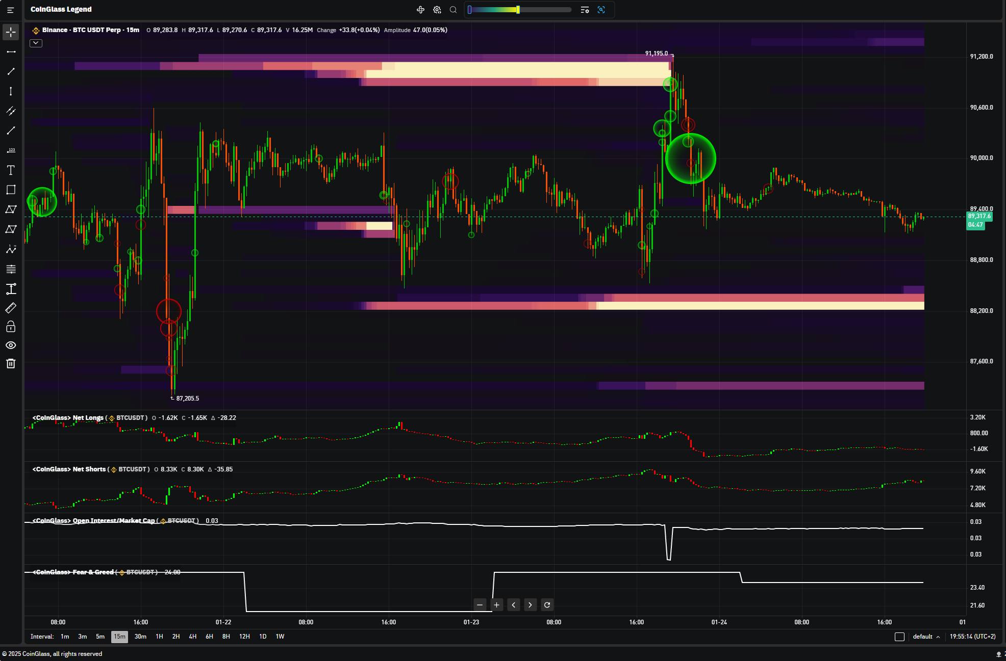
Using it is similar to the idea of traditional charting platforms, but the main value here is that you can add liquidity and Order Flow data alongside price action itself.
My advice?
Don’t try everything at once.
Start with:
Liquidation Heatmap + Open Interest + CVD + Liquidity Heatmap
Understand them really well first, then expand your toolkit based on your own trading system.