
Liquidation Heatmap Explained Simply
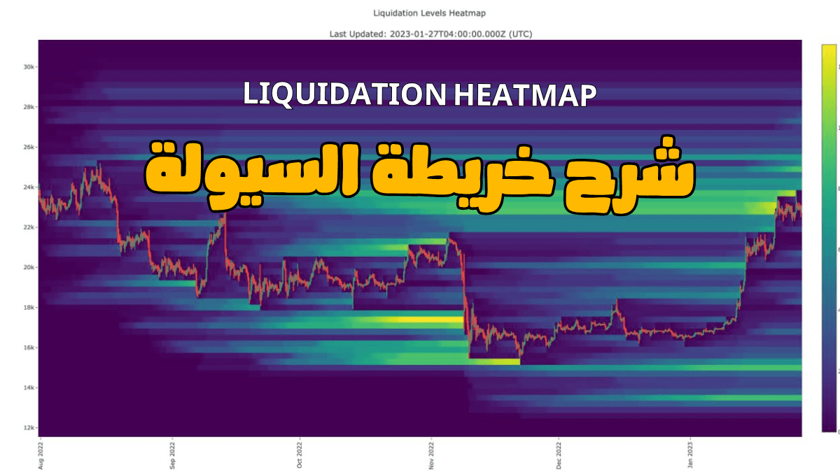
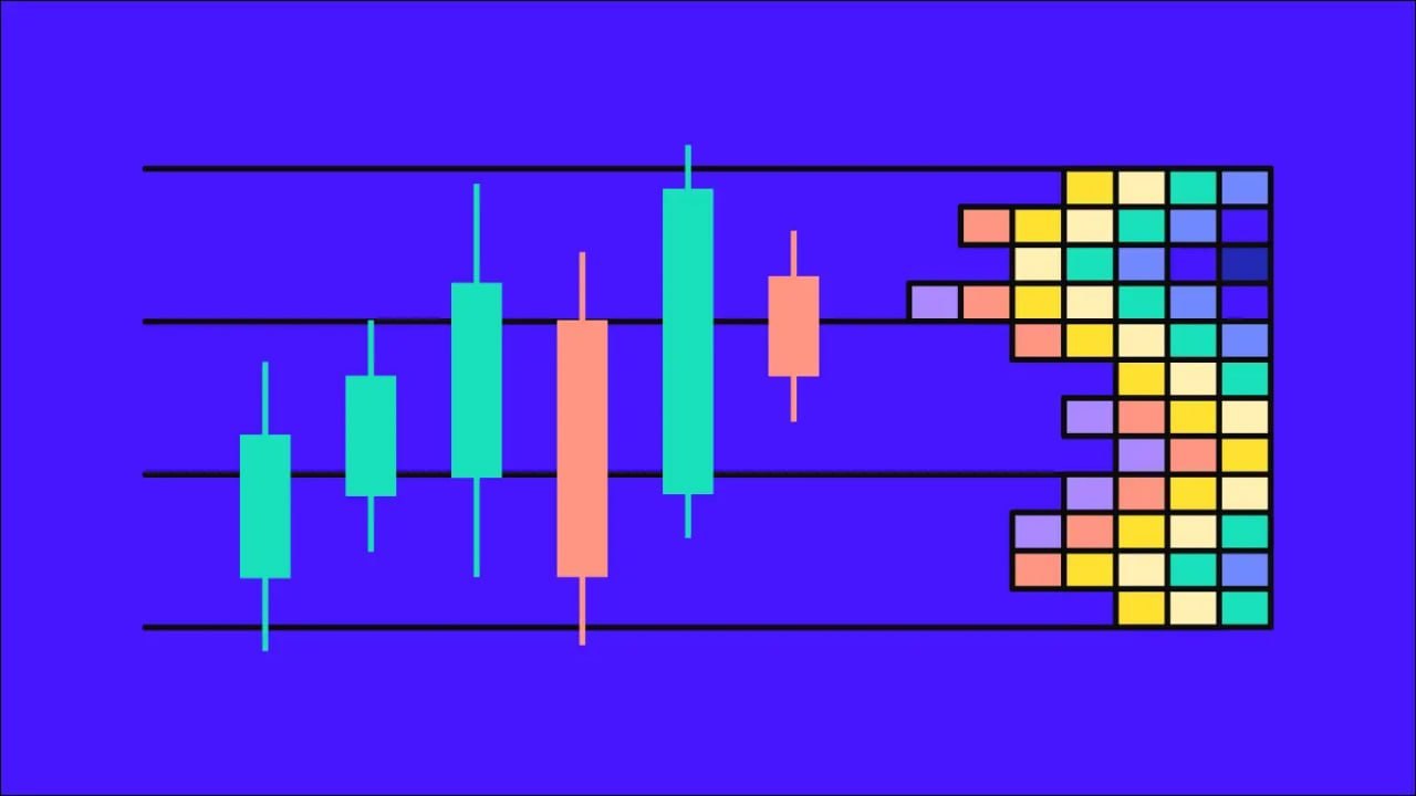
Let’s start with a better question first…
Who usually pays the price for violent moves in the market?
Most of the time, it’s the traders using high leverage — especially futures traders.
And that’s exactly where the Liquidation Heatmap comes in.
This tool is one of the most important tools for understanding where liquidity is concentrated in the market.
But the problem is that a lot of people use it the wrong way.
They rely only on the heat colors on the map — which I’m going to explain to you in full today — and they look at a strong-colored zone and immediately say:
“Price has to go there.”
And unfortunately… that’s not true.
To use the Liquidation Heatmap correctly, you first need to understand:
what it actually shows
why price may move toward certain zones
and when the heatmap is truly useful in your analysis
Simply put…
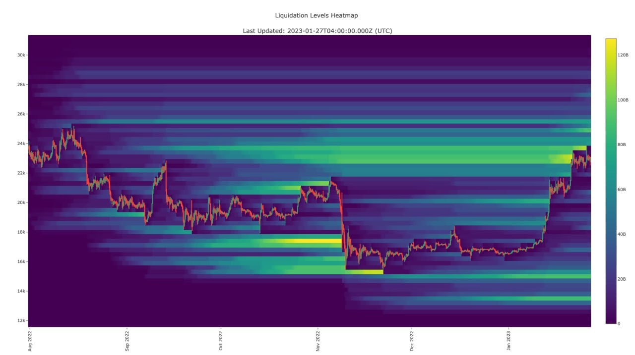
It’s a map that shows the areas where there is a high concentration of leveraged positions in the futures market.
In other words, traders have opened Long or Short positions using leverage, and if price reaches certain levels, those positions may be liquidated.
When a trader enters a position using leverage, they’re trading with capital that’s larger than their actual account balance.
The problem is that if price moves against them by a certain amount, the exchange may force-close the position to protect the funds being used in that trade.
And that’s what we call liquidation.
Liquidation creates forced orders in the market.
For example…
If a large number of traders are holding Long positions, and price starts dropping until it reaches their liquidation levels, those positions may begin to close automatically.
The liquidation process itself creates sell orders.
And the more liquidations happen, the more sell orders hit the market.
It works like a domino effect:
one liquidation starts,
it pushes price further,
that move triggers new liquidations,
and those new liquidations push the move even more.
And that’s one of the reasons why price can sometimes move with extreme speed and aggression.
Here’s a very important point you need to understand:
The heatmap doesn’t tell you the fair value of the asset.
And it doesn’t define support and resistance in the traditional way.
What it tries to show you is where there’s a large concentration of positions that could be liquidated.
In simpler terms…
It helps you see potential liquidity zones in the market.
And that matters because, at the end of the day, the market needs liquidity in order to move.
The larger the number of highly leveraged positions concentrated in a specific area, the higher the chance that a bigger wave of liquidations could happen if price reaches that zone.
Reading the Liquidation Heatmap is relatively simple.
The colors on the map show the strength of potential liquidity concentration.
The stronger the color, the more likely it is that there’s a larger concentration of positions in that area.
And the larger the number of positions that could be liquidated, the more important that zone becomes from a liquidity perspective.
But here’s something you need to be very careful about:
## Color strength alone is NOT a valid reason to enter a trade
So just because you see a huge liquidity zone above price doesn’t mean you should instantly go Long because you expect price to move up there.
And just because there’s a large liquidity cluster below price doesn’t mean you should go Short and wait for the market to drop and liquidate it.
Without context, it stops being a tool that helps your analysis…
and turns into a tool that can lead you into bad decisions.
Because liquidation creates immediate orders in the market.
When Long positions get liquidated, they create selling pressure.
And when Short positions get liquidated, they create buying pressure.
These forced orders add both liquidity and movement to the market.
And that matters especially for traders and institutions dealing with large size, because entering and exiting the market requires enough liquidity to absorb those orders.
That’s why you may sometimes notice price moving from one liquidity cluster to another.
But that does not mean every move in the market is caused by trader liquidations.
And it also does not mean price must visit every zone that appears on the map.
And that’s one of the most important things you need to keep in mind when using this tool.
Thinking that every liquidity zone must be visited by price
Entering a trade just because you see a red or yellow area on the heatmap
Using the heatmap on its own without context
Treating it like a guaranteed prediction
Price may get close to a liquidity zone and then reverse.
The liquidity itself may disappear, or positions may get closed before price even reaches it.
And depending on momentum, the market may choose a liquidity zone that’s closer or farther away.
Look at it as market behavior, not as a direct signal
See where the liquidity sits relative to the trend
Watch whether price is moving toward it or rejecting it
Connect it with volume, market structure, and your overall technical analysis
Treat it as a possible scenario, not a certainty
In other words, if price is already moving up while there’s a large liquidity cluster below, that could mean a lot of traders are still Long there.
So the market might drop first to liquidate them before continuing higher…
and it also might ignore that liquidity and keep pushing upward anyway.
The key question becomes:
Is momentum strong enough to keep price moving higher, or does the market still need to sweep that lower liquidity first?
That’s why the Heatmap gives you probabilities, not certainties 🎴
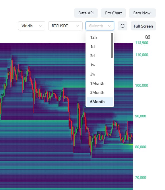
Choose a timeframe that matches your trading style
Don’t make the sensitivity too high
Focus on the major liquidity clusters
Keep watching how the heatmap changes over time
To sum it up, the Liquidation Heatmap is a tool that shows you where traders are heavily concentrated in the market.
It does not tell you where to enter,
it does not tell you the market direction,
and it does not guarantee that price will move to a certain zone.
It’s simply a lens that helps you see liquidity and trader positioning more clearly.
Try it yourself:
* open the chart
* watch how price behaves around liquidity zones
* and ask yourself:
Is the market chasing liquidity… or not?
And always keep one thing in mind:
I’m explaining the tool in a practical way — but how you use it, and how you benefit from it, should always come from your own thinking 🧠